Cooklet
// End-to-End App for Beginner Cooks
Timeline
Jul - Aug 2025
Tools
Figma, Figjam
Role
UI/UX Design, Branding, Research, Personas, User flow, Wireframing, Prototyping, Usability testing


PROJECT OVERVIEW
As part of my UI/UX bootcamp with DesignLab, I created Cooklet, an end-to-end cooking education application.
This application is designed to help beginner cooks build their confidence by learning the basic kitchen fundamentals through structured lessons, guided courses, and quick-reference tools.
PROBLEM
Existing cooking apps focus on recipes and lack basic cooking fundamentals for new cooks. This leaves beginners in the kitchen without a reliable resource, leading to hesitation, mistakes, and avoidance of cooking.
SOLUTION
By combining short, easy lessons, visual guidance, practical and accessible tools all in one place will prepare users, reduce cooking stress, and build long-term kitchen confidence through reliable and easy access to important information.
The Design Process

Empathize
USER INTERVIEWS
Four individuals were interviewed who are all beginner cooks in the kitchen. These interviews helped me gain an in depth understanding of the participants' behaviors and habits of cooking so I can understand their needs.
Key takeaways
All participants believe short, structured lessons are the most effective way to learn cooking fundamentals and gain kitchen confidence.
To understand kitchen basics, all participants mentioned they are visual learners with half of participants mentioning it’s more effective with hands-on learning.
Most participants tend to be overwhelmed in the beginning stage of cooking, with the feeling of not being well prepared.
“I’ve taken a couple of cooking classes and learning by doing was always the best way of understanding what's right and wrong.”
- Janet (Participant 1)
“Frying things as opposed to baking things as opposed to boiling things, there’s all different facets of cooking that I need to know and it would be nice to have a source that would do that. It would give me all the basic fundamentals of cooking.”
- Fred (Participant 2)
COMPETITIVE ANALYSIS
The three products below are all related to learning basic fundamentals of cooking. Comparing these products provided key insights to clearly show the factors that contribute to their success or failure.

Zest

Youtube

Skillshare
Challenges
Does not support structured educational tools, not enough courses to learn basic fundamentals, and poor user experience with ads.
Strengths
Offers a diverse content library and powerful recommendation algorithm with educational videos and self-paced courses fit diverse schedules.
Define
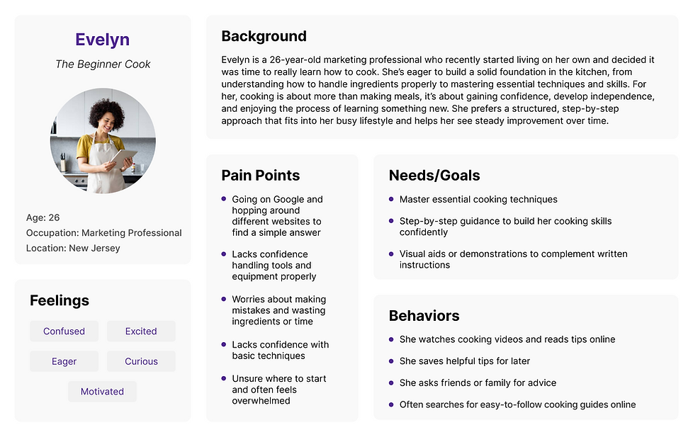
USER PERSONA
By creating a user persona, I gained insights into the actual users’ needs, goals, and frustrations. Through empathy, I can provide a more meaningful user experience. The objective is to find solutions to address the users’ needs and pain points, based on the user persona that has been created.
POV STATEMENT
Many beginner cooks feel overwhelmed in the kitchen because they don’t know where to start. With no clear understanding, they’re unsure which tools are most important, which skills to learn first, or how to build confidence step-by-step.
HMW QUESTIONS
-
How might we guide beginners through a clear, step-by-step learning path that builds confidence?
-
How might we make learning to cook feel fun and rewarding instead of overwhelming?
Ideate
PRIORITY FEATURES
Based on user interviews, I've identified the main features needed to ensure the user's needs are met. These core features form the roadmap for creating an engaging and supportive learning experience.
Short, Structured Lessons
Each course features a certain amount of lessons for the user to go through that are short with quick activities for hands on learning as well tips and imagery
AI Chat for Questions
Section where the user is able to simply ask a question and receive an answer
Reference Guide
Quick reference guide for temperatures, heat settings, food storage, measurement conversions, ingredient substitutions, etc.
How-to Videos
Videos within in each lesson to show the user how to visually do a task
SITEMAP
By creating this sitemap, I'm able to simplify navigation and create a logical flow between the app’s core areas. This serves as a blueprint for an experience that feels both structured and easy to explore for users.

USER FLOWS
After creating a user persona, I then designed a user flow to map how users move through Cooklet. The flow highlights main paths such as exploring by skill level, jumping into an active lesson and starting a lesson from new, ensuring navigation feels simple and intuitive.

MID-FIDELITY WIREFRAMES
With mid-fidelity wireframes, I can concentrate on the layout and hierarchy without being distracted by aesthetic details. This stage is crucial for obtaining feedback and making modifications before moving forward.

Prototype
HIGH-FIDELITY WIREFRAMES
With incorporating the design choices to the mid-fidelity wireframes I’m able to see a clearer representation of the final product. It’s important to stay true to the brands identity and values by staying consistent with the content and style throughout the application. By creating these wireframes, I'm able to move forward with prototyping and effectively bring these designs to life.

STYLE GUIDE
For the color palette, the green color I've chosen is meant to give a calm and natural feeling that connects to cooking, food, and growth, while the yellow adds a pop of energy that makes the app feel fun and motivating. Together, the colors balance trust and positivity, helping new cooks feel supported while keeping the overall experience bright and approachable.
The logo combines both a book and an apron to show that the application is about learning the basic fundamentals of cooking with guides and lessons. The bookmark also represents the saved courses and lessons that the user can revisit.

Test
USABILITY TESTING
The testing consists of four participants all who are beginners in cooking. They were asked to do two tasks: Browse all beginner courses and starting then completing a lesson. The goal is to see how easily the users navigate through the application, get feedback on the look, feel, and functionality, and lastly identify any points of confusion in the layout and flow.
Participants felt the overall look was visually appealing and clean. It was simple and fun to navigate through the courses and the lesson especially. The main point of confusion with all participants was when they reached the end of the lesson, the percentage did not show "100% completed" which leaves the user guessing how they finish the lesson.
Before testing

After testing


An additional "Continue" button was added under the "Quick Recap" section
When the user clicks on "Continue" the percentage is then changed to "100% completed" so the user is aware they've completed the lesson
UPDATED USER FLOW
I've updated the original user flow to show that the user can resume a lesson more easily directly from the Courses screen. Originally, the user was only able to resume the course, but with further testing it was apparent they wanted to access the lesson itself considering there was an additional way of accessing the course from the Course screen as well.
.png)
FINAL PRODUCT
Conclusion
KEY TAKEAWAYS
Main insights: Based off competitive analysis and other types of research, most applications relate to recipes, lacking the space for users to learn about the cooking basics. It was very insightful to see how many beginner cooks feel unprepared and rely on others to feel comfortable in learning.
What I've learned from this project: I've enjoyed learning about the participants behaviors and habits when it comes to cooking. Learning their styles of learning combined with their pain points with basic kitchen fundamentals helped me come up with a product that caters to their needs. Paying close attention to the beginning phase of research will make the user experience far better.