Wish Boutique Redesign
// Responsive Web Design
Timeline
May - Jun 2025
Tools
Figma, Figjam
Role
UI/UX Design, Research, Personas, User flow, Wireframing, Prototyping, Usability testing

PROJECT OVERVIEW
As part of my UI/UX bootcamp with DesignLab, I created a website redesign for Wish, a local family-owned boutique.
With a total of five store locations, this responsive web design project focuses redesigning the Denville, NJ location website.
PROBLEM
Wish’s outdated website design offers a poor user experience by blocking potential shoppers from seeing new inventory, store information, and accessing other services.
SOLUTION
The goal is to update Wish’s online presence by providing users with store information, updates and show new inventory. This website should align with the brand identity and entice more customers to visit the boutique.
Wish boutique website before redesign

The Design Process

Empathize
USER INTERVIEWS
I interviewed four participants who currently shop at Wish or depending online to look for store information. This helped me gain an in depth understanding of the participants' behaviors and habits when they're shopping either in person or online so I’m able to find effective ways to help fill their needs and achieve their goals.
Key takeaways
Customers enjoy how the layout of Wish is neat and organized considering the amount of variety of clothing, jewelry, and accessories. They expect to see the same neatness and clean layout in the redesign.
Content on the current website was displayed randomly with no clear structure making it difficult to understand what type of information is important.
All participants wanted to see imagery since there was no visual content leading to confusion regarding its true purpose.
“When I went into the store for the first time, I was pleasantly surprised by the quality, assortment, and just how nice the store was.”
- Janet (Participant 1)
“The current website feels overwhelming because they have too much information that's not in the right order.”
- Jewel (Participant 3)
Define
USER PERSONA
Based on the user Interviews, I came up with a user persona that captures the users frustrations, needs and goals when it comes to shopping online.

POV STATEMENT
The site’s navigation structure is confusing and cluttered, making it hard for users to see new products, store information, or contact details efficiently.
HMW QUESTIONS
-
How might we keep the website content fresh and engaging so that customers always see up-to-date information and promotions?
-
How might we change the design to be more intuitive and user-centered?
Ideate
USER FLOWS
Creating this user flow helped show the user journey and their potential decisions. The following flow takes the user through the redesigned website with many different types of information about Wish Boutique.

MID-FIDELITY WIREFRAMES
With mid-fidelity wireframes, I can concentrate on the layout and hierarchy without being distracted by aesthetic details. This stage is crucial for obtaining feedback and making modifications before moving forward.

Prototype
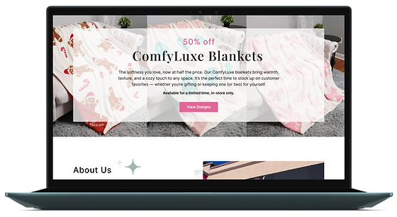
HIGH-FIDELITY WIREFRAMES
With incorporating the design choices to the mid-fidelity wireframes I’m able to see a clearer representation of the final product. It’s important to stay true to the brands identity and values by staying consistent with the content and style throughout the website.

Test
USABILITY TESTING
The goal is to understand how users navigate and complete the tasks within the website. I asked four participants to go through a few tasks: Browse featured products and to find key store information such as hours, store policy, services, etc.
Participants felt the overall look was visually appealing and enjoyed the layout of all content. The test was successful in terms of the website being easy to navigate through with completing and understanding the tasks in a quick manner. All participants gave a 5 (very easy) to perform the tasks but some participants had comments about making the theme more prominent throughout the page and fixing the order of a couple images.
FINAL PRODUCT


Conclusion
KEY TAKEAWAYS
Main insights: Customers felt the original website didn’t reflect the boutique’s style or quality. These insights showed a clear need for a more intuitive layout, stronger branding, and better support for both browsing and learning about the store, especially for first-time visitors.
What I've learned from this project: I've learned how important it is to listen carefully to users and let their feedback drive design decisions. It also showed me the importance of iterative testing to refine ideas and helped me refine my skills in responsive design.